
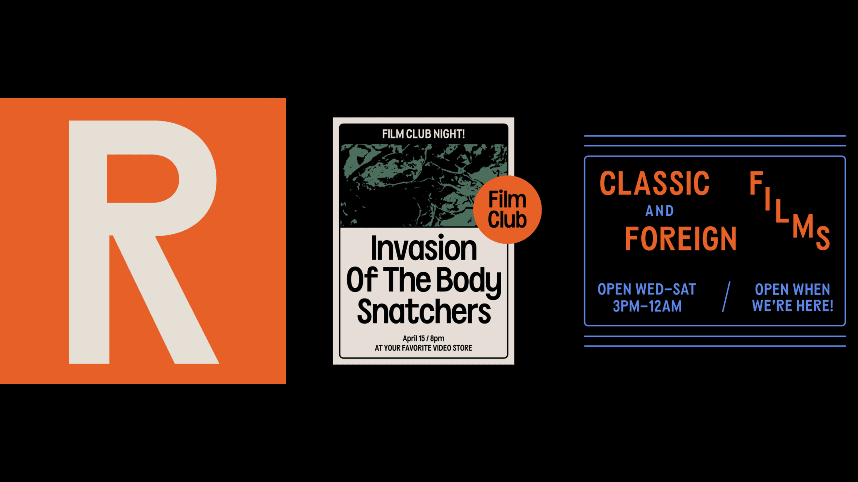
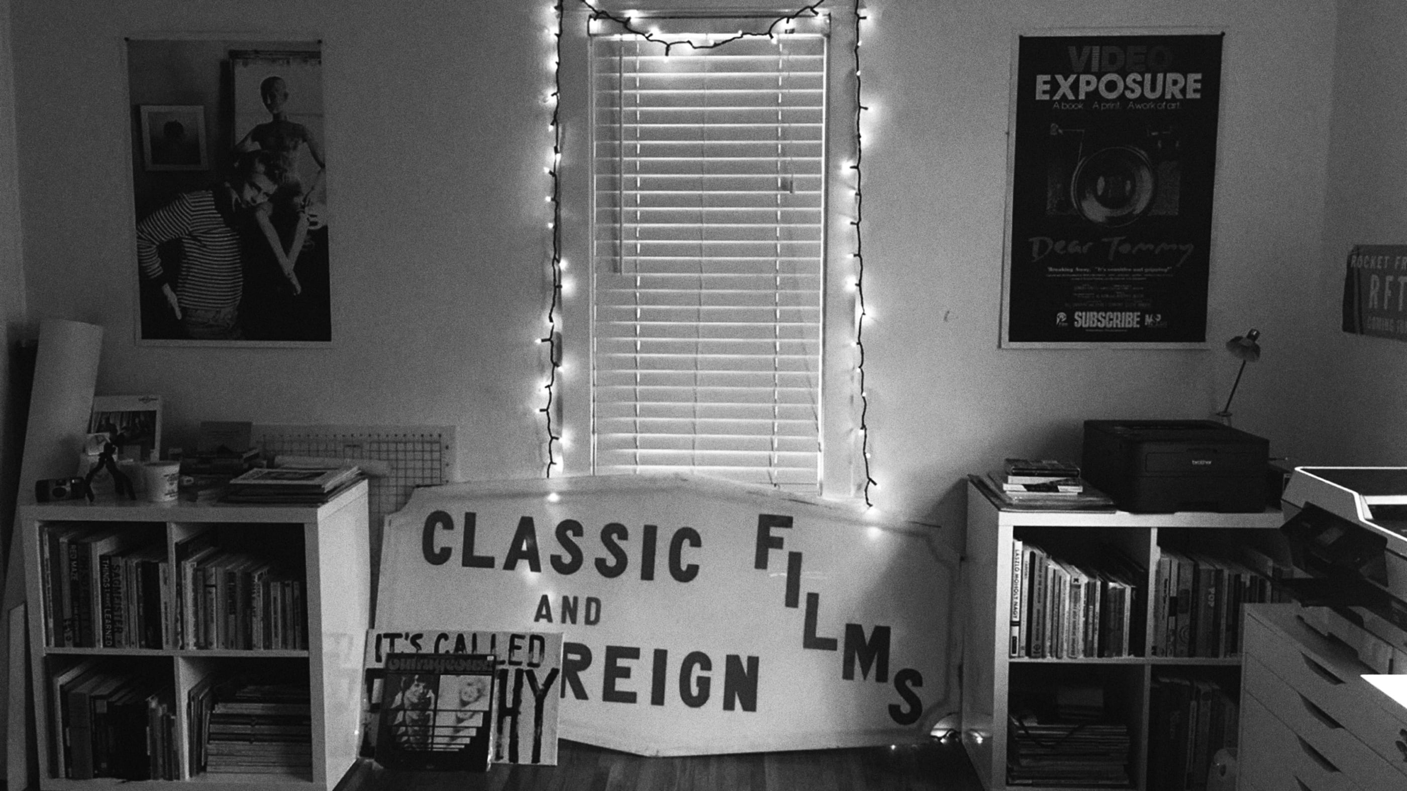
About the Project
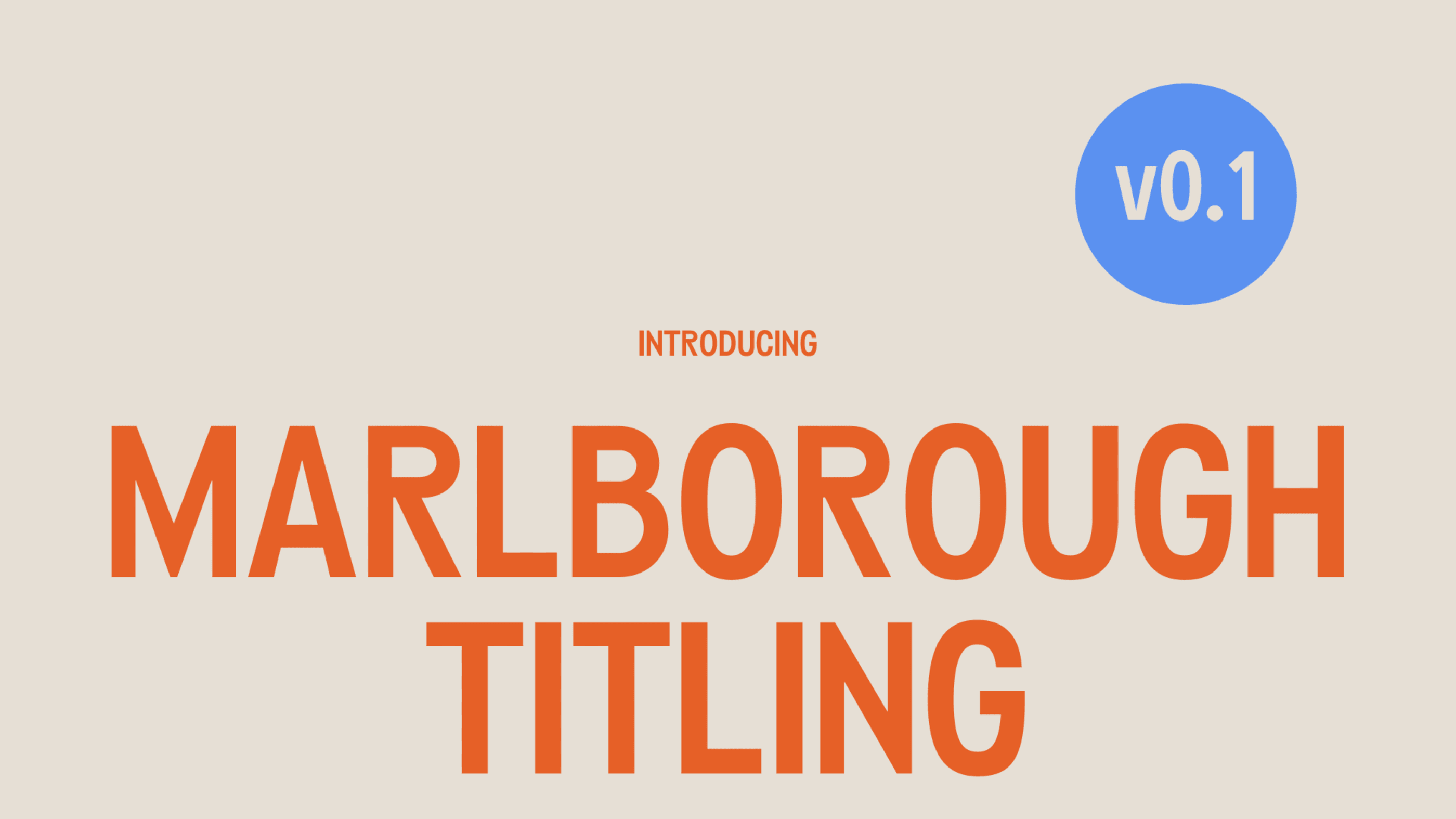
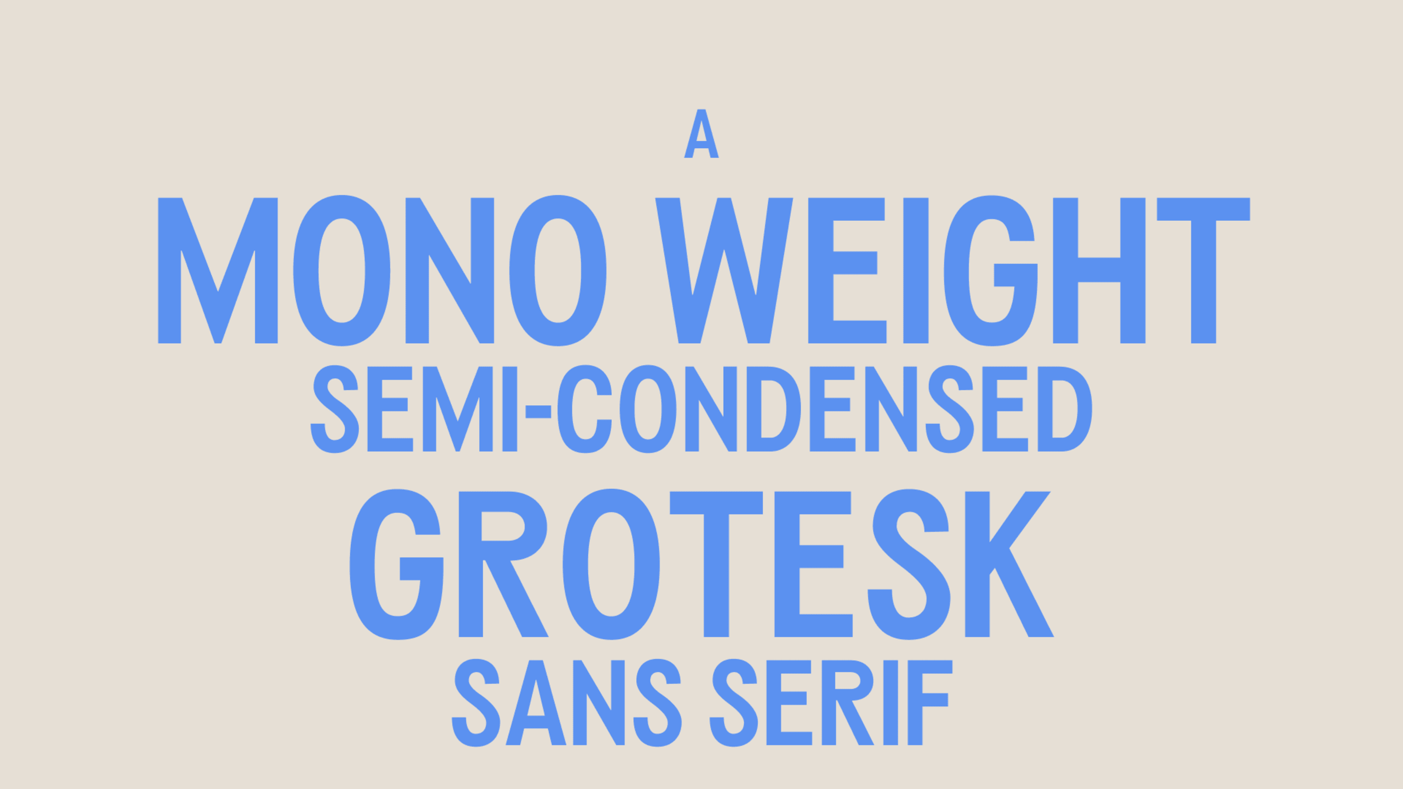
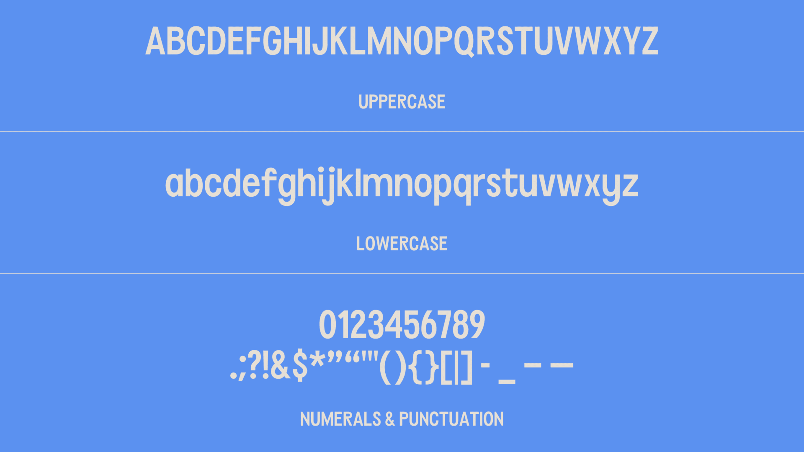
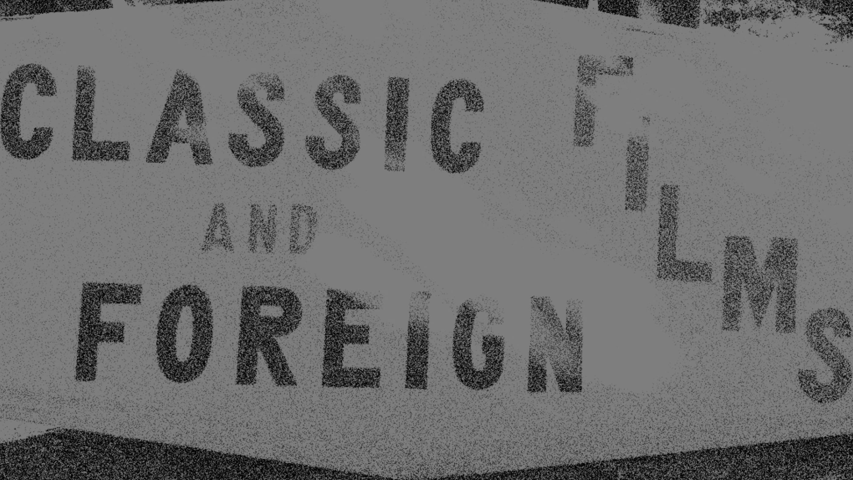
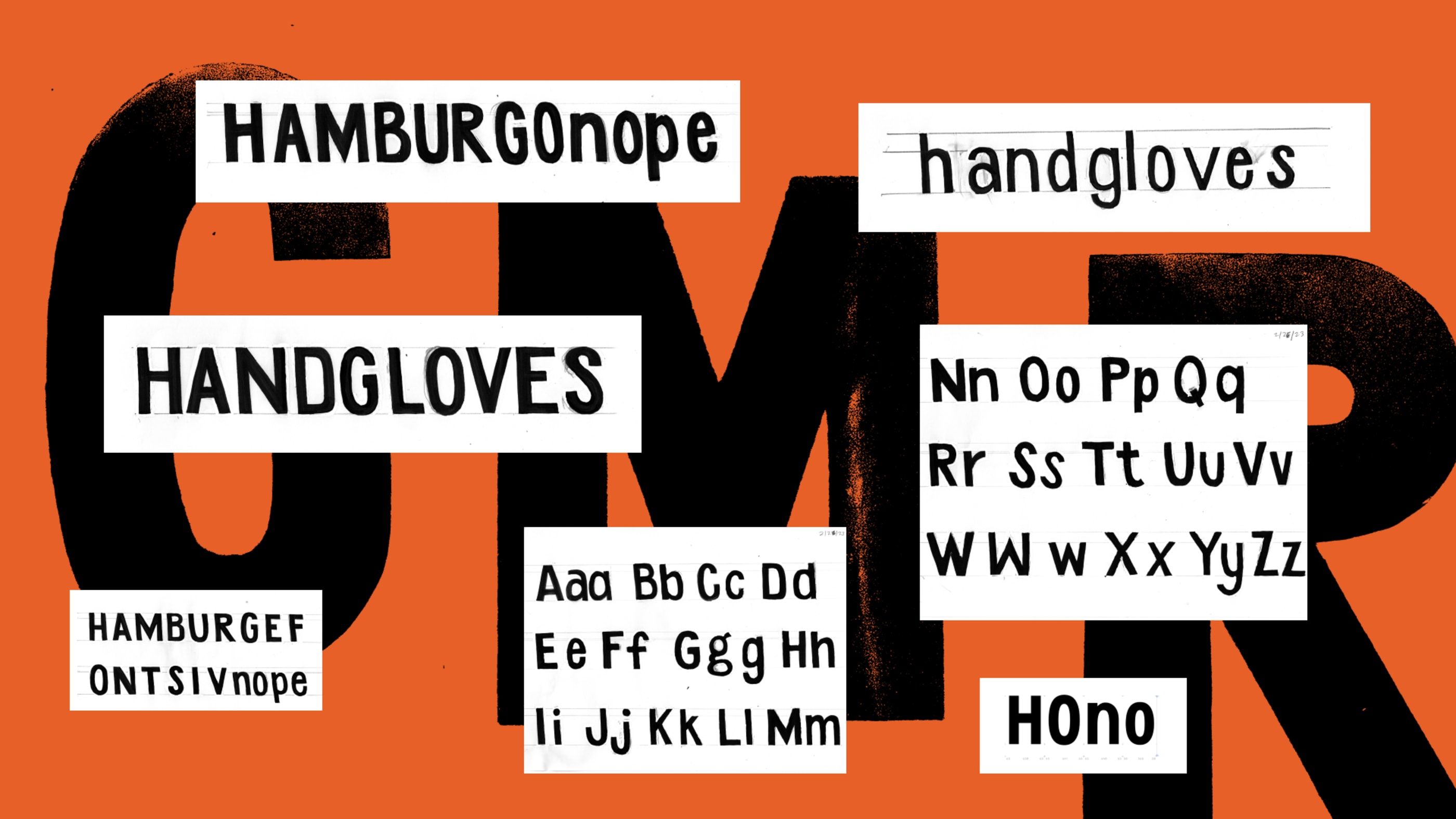
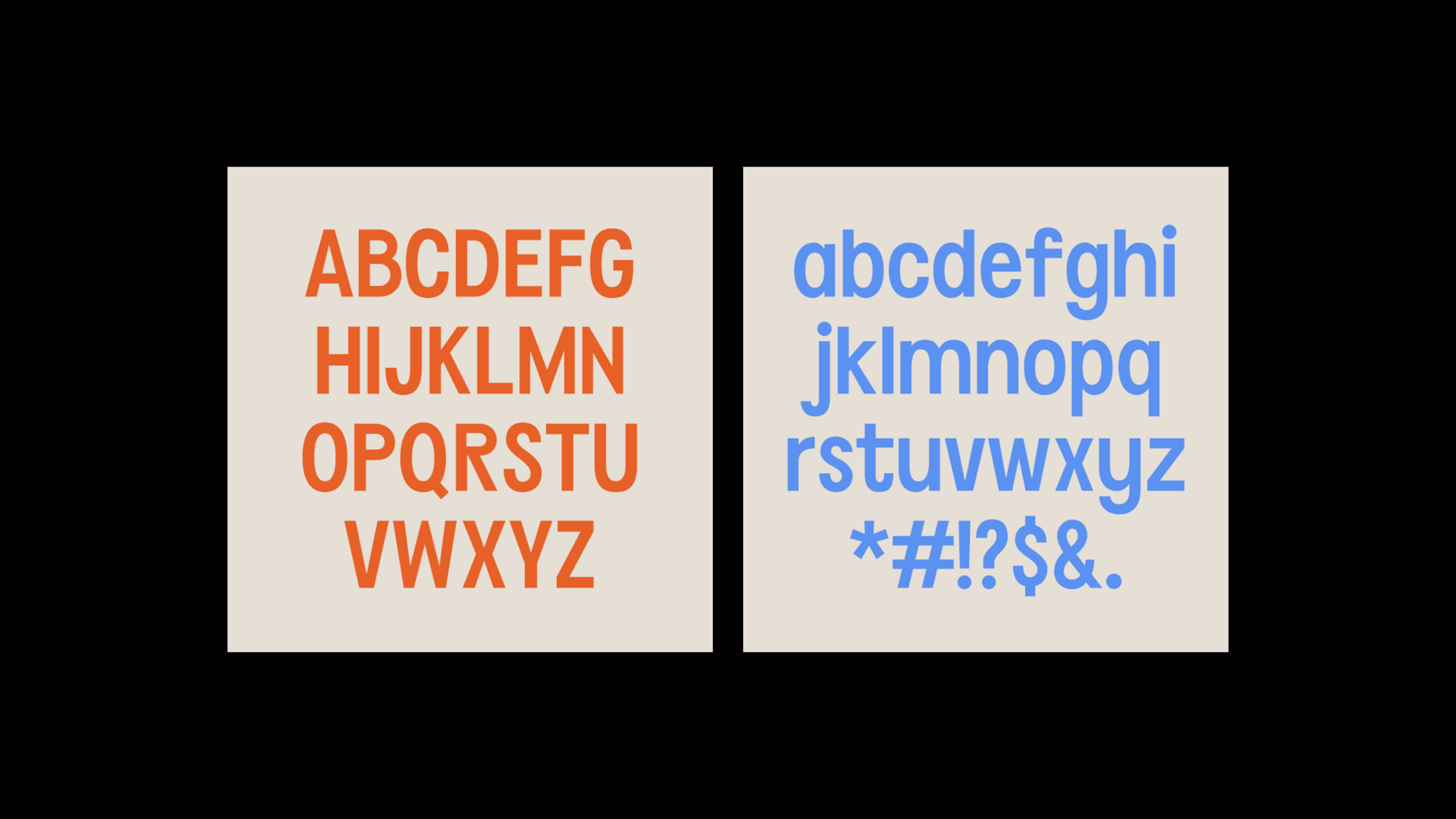
Marlborough Titling is a display font inspired by an old hand painted video store sign outside of what was once, Kensington Video. I have been obsessed with the sign and, fortunately, had the pleasure of meeting the person who hand-painted it for their family-owned business many years ago. The name comes from the street where it was painted.
Since this was my first structured type design project, I don’t plan to expand on it beyond a single weight, but it has been a great project to start with!
Thanks
Marlborough Titling was created over the course of 10 weeks, in the Introduction to Modern Type Design workshop through Letterform Archive.
Instructor: Kel Troughton of Overlap Type
TA: James Plattner